Okay — honest take, no fluff: the iPhone 17 looks like someone hit “refine” instead of “rethink.” I know that sounds petty, but hear me out.
First impressions matter. I unboxed one last week and my immediate thought was…meh. It’s clean. It’s polished. It’s safe. But “safe” isn’t exciting. Not for a flagship that used to make people gasp. The surface-level prettiness is there, sure, but the phone is missing character. And design is partly emotion — not just materials and tolerances.
Grip and feel? Ugh. Those edges are mercilessly slippery. Hold it for a long scroll session and you’ll notice the micro-shifts — the phone sliding in your hand, your thumb hunting for purchase. Little things like rounded corners or a gentler chamfer used to make a phone disappear into your hand; this one insists on being noticed. I caught myself readjusting constantly while reading a long thread on my commute. Tiny annoyance. Turns into daily friction.
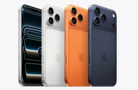
And the camera bump. Look — I love a phone with photography chops. But the visual language here is off. The lenses sit in this dramatic, almost defensive plateau, like it’s compensating. It’s loud. It doesn’t integrate. Good industrial design makes powerful components feel inevitable and elegant — this feels patched-on, like someone prioritized optics over aesthetics and then shrugged.
Colors? Bland. I get that Apple wants broad appeal, but some of the new finishes feel neutered. Give me a color that chooses a side. Give me a texture that says something. Instead we get fifty shades of “safe.” That’s fine for corporate spreadsheets, not for products people pick as tiny personality statements.
Ergonomics again: weight distribution is a small miracle of engineering when it’s done right. Here, it’s…fine. Noticeably fine. You won’t complain when you pick it up. But you won’t love it either. Which is the whole problem. When every iteration aims to avoid risk, we end up with devices that are impeccably adequate and emotionally forgettable.
I’ll call out something else — visual hierarchy. The phone looks like it’s trying to headline its camera and nothing else. That’s a weird message. A phone should feel balanced: camera, screen, buttons, haptics — all singing together. When one element screams the loudest, the overall harmony collapses.
Now, I’m not saying the iPhone 17 is bad. It’s competent. It probably takes terrific photos, runs smoothly, and lasts all day. But competence is different from craftsmanship. Apple used to deliver design that made you sigh and then keep using the product because it felt right. This model? It’s competent and forgettable.
What I want to see next: a deliberate risk. Subtle profile changes that actually improve grip. A camera treatment that integrates instead of advertises. A bold finish or two that aren’t pandering. And for the love of god, stop designing for the lowest common emotional denominator.
Final thought: brands grow cautious. Markets reward conservatism. But design is where you remind people why they cared in the first place. The iPhone 17 didn’t remind me. It’s time Apple remembered how to surprise, not just refine.
These are solely the author's personal opinions and do not represent the website's position.
This article is exclusively provided to Hugdigi.com by the author. Reproduction without permission is prohibited.